Get hired. Get connected.
PROJECT
ROLE
DURATION
Hire Meet
UX/UI Designer
Mar - Apr 2022
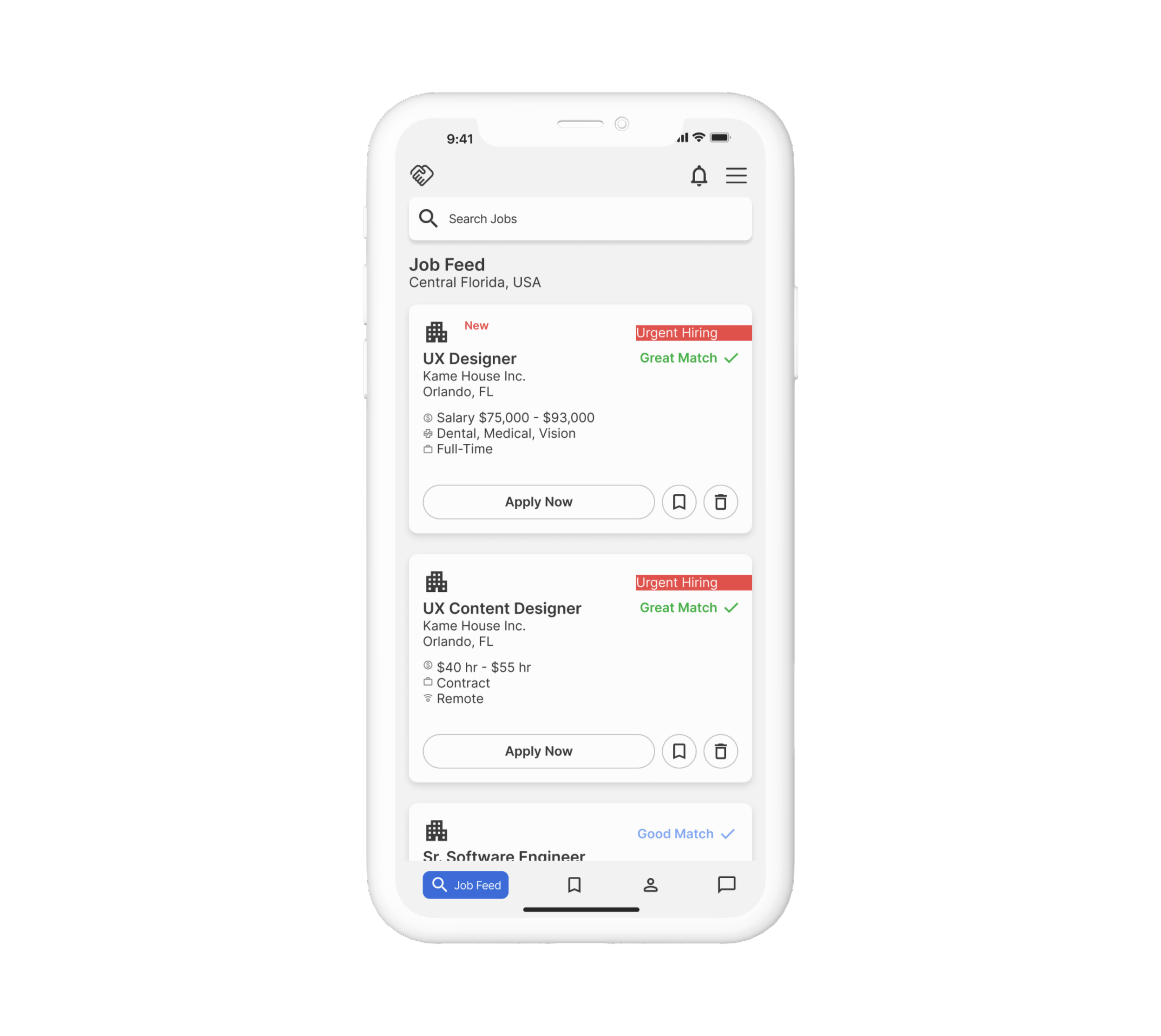
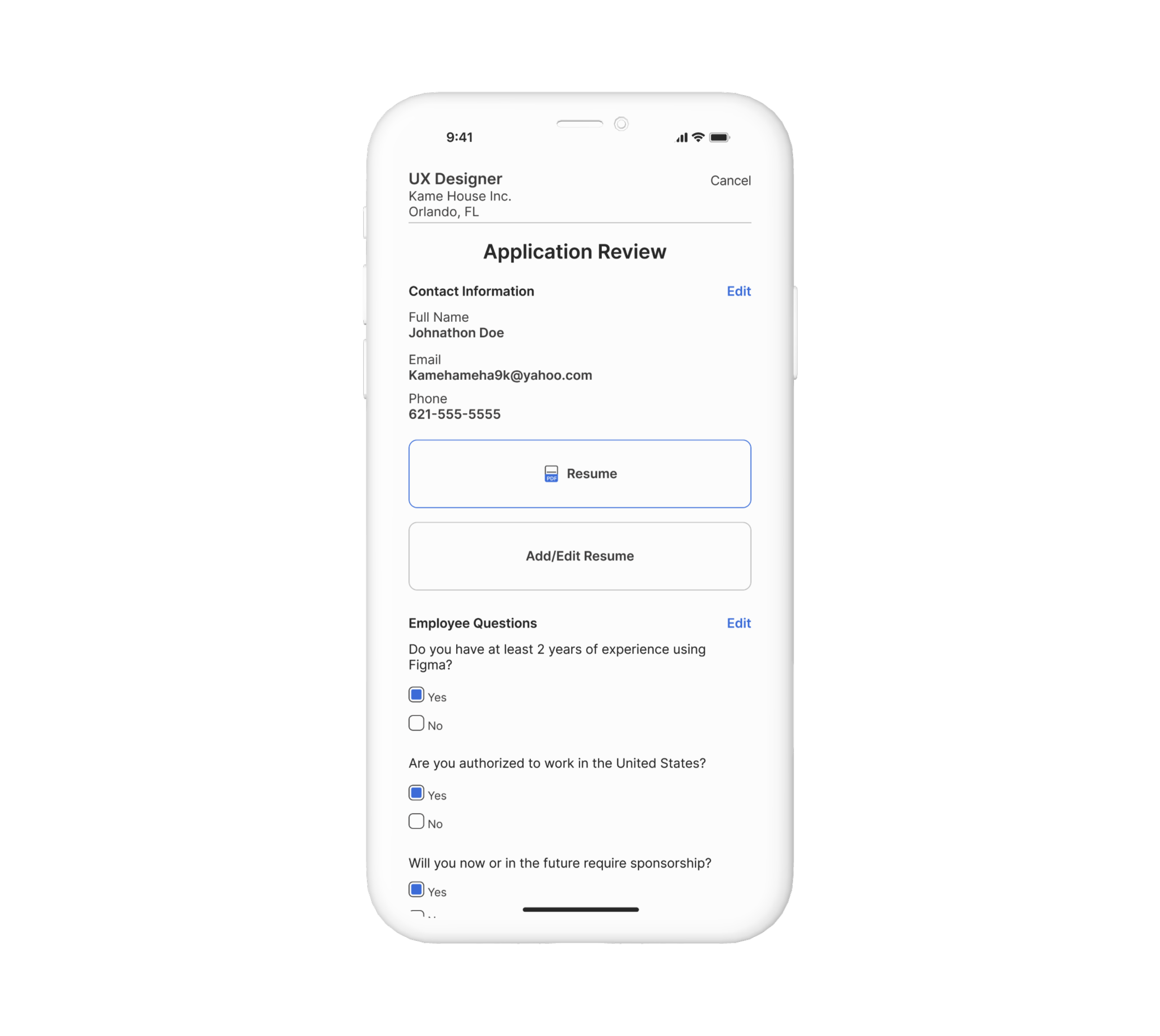
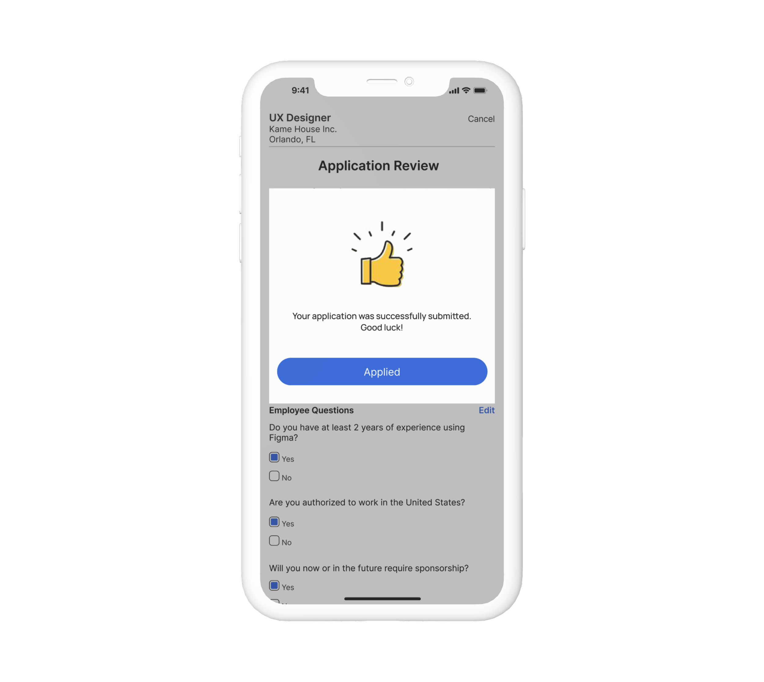
Hire meet is an employment discovery based application whose mission is to provide the necessary tools for users to land their dream job.
PROJECT OVERVIEW
PROBLEM
How might we design a job application platform that optimizes user experience, encourages engagement, and streamlines the applying process for both applicants and hiring for employers?
Define
1
Research
2
3
Ideate
Design
4
Test
5
Research
DESIGN STRATEGY
Target Audience: Open to all users 18 and up.
Channels: Responsive design made for both mobile and desktop platforms.
Competitors: LinkedIn, Indeed, Craigslist, and Monster jobs.
There are a number of apps to help people find a new career. I compared some of the most popular job seeking apps to see what they do well and what could be improved. Keeping these findings in mind helped me make better design decisions moving forward.
Competitive Analysis
I started off by discovering and collecting some of the existing research about millennials and unemployment ratings. My objectives were to:
Find out why people are leaving their current roles.
What types of obstacles and frustrations do people face when job hunting?
Learn about any career goals and what steps they are taking to get there.
Secondary Research
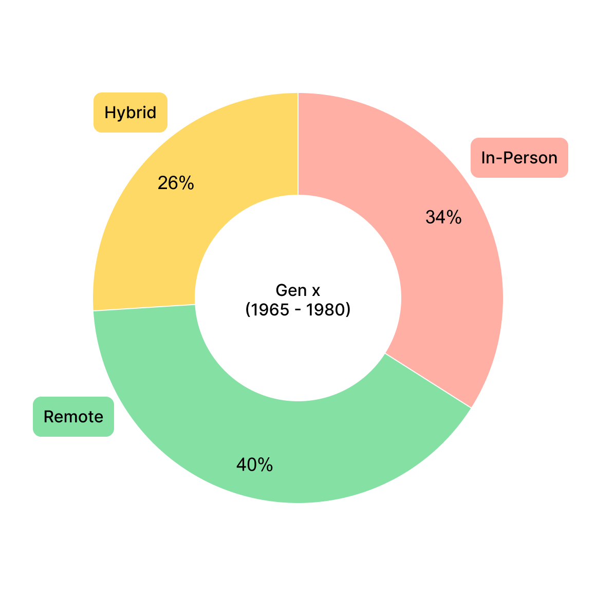
I did an online survey looking for participants willing to speak about their preferred work preferences. I separated the results based on generation.
Quantitative Analysis
QUESTIONS
On a scale of 1 to 5, with 1 being the lowest and 5 being the highest. How satisfied are you in your current role?
On a scale of 1 to 5, with 1 being the lowest and 5 being the highest. How comfortable do you feel about your current job security?
After running a competitive analysis and diving into the secondary research, it's clear there are a lot of job search engine app options.
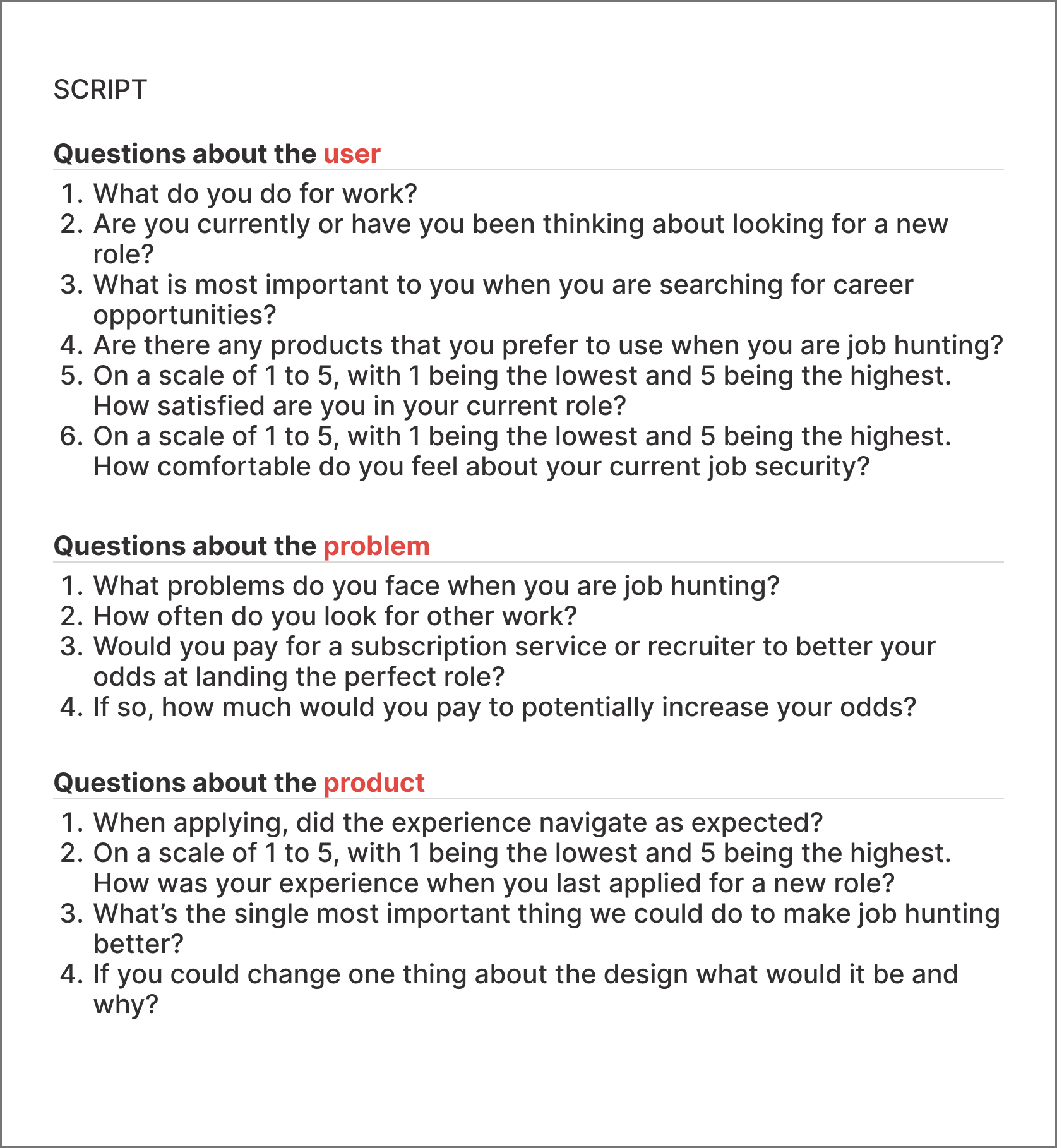
Now I wanted to talk to potential users about what is missing and what need is not being met. I sat down with 8 participants ranging in age from 22-34 to understand how they manage their job search.
MORE QUESTIONS: THE INTERVIEW
INTERVIEW INSIGHTS
“Job searching can be so time consuming.”
“I see a lot of out dated posts. I apply sometimes and the job has already filled.”
“I don’t feel satisfied in my current role, but I’m too nervous about getting back in the market.”
“Recruiters rarely get back to me.”
“Distance is important to me.”
“I research the companies I’m applying to.”
RESEARCH ANALYSIS
After interviewing these users I starting analyzing and mapping out the data I acquired. I began to unravel a pattern that gave me insight into my target audience and the problems they face. I started first by categorizing my thoughts into an affinity map.
Age Switched Careers
22-24
31-34
Curent Education lvl
Bachelors
High School
Increase income
2nd income
Leave current role
Land dream career
Afraid of not being good enough
Distance
Outdated posts
Salary & benefits
Longevity
Lack of confidence in the market
Quotes
“I’ve been thinking about pivoting careers.”
“I want to build generational wealth.”
Goals
27-29
Closer to home
Better schedule
Skills
High School
Bachelors
Mentor
Masters
Bootcamp
Certified
Experience
Concerns
Define
I then created empathy maps to synthesize the data and to better map out user pain points, goals, feelings, and thoughts.
Empathy Map
I created two personas to represent my target audience. Keeping these personas in mind throughout the design process, helped me keep the users as the center of the design.
Personas
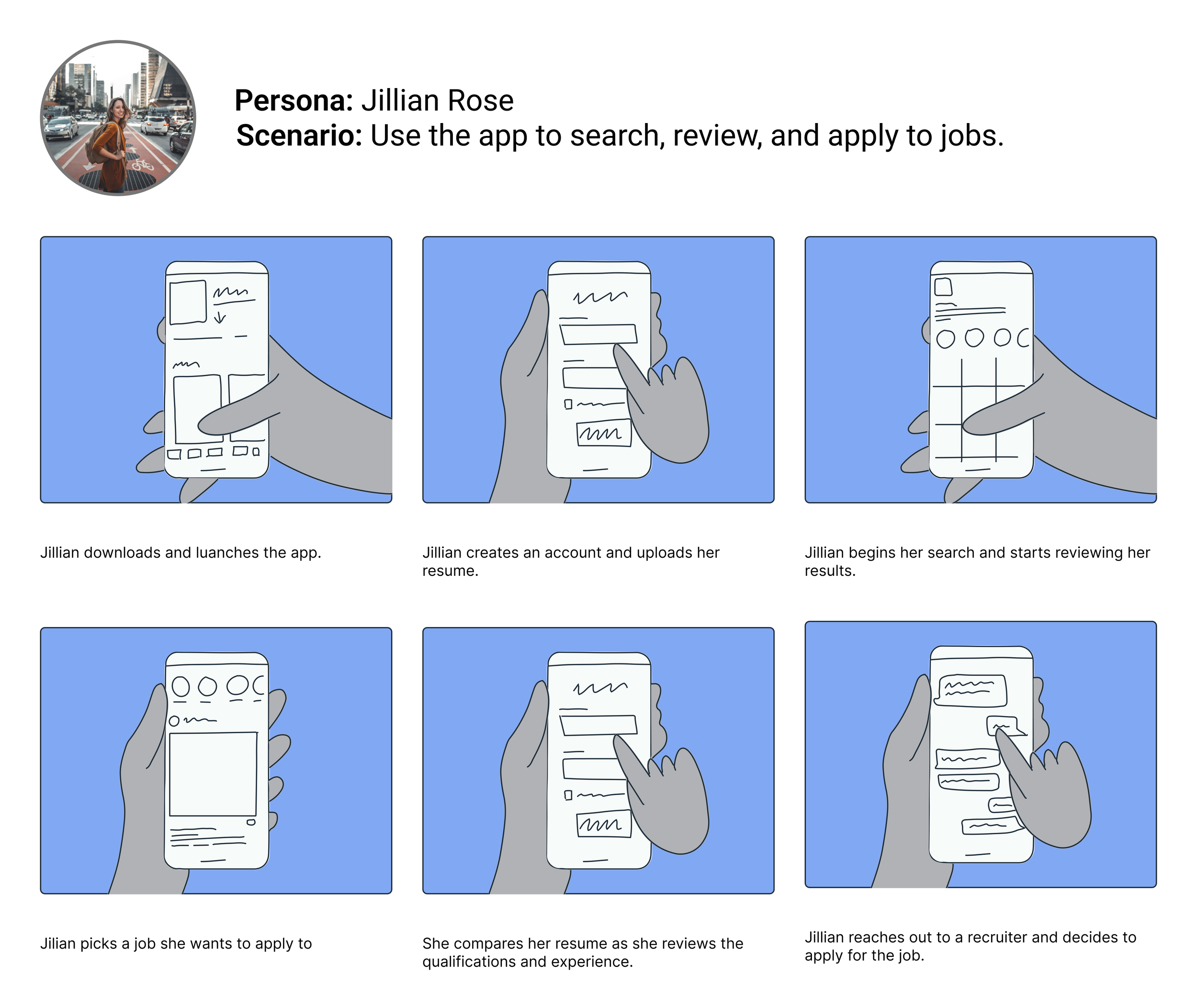
I created two types of storyboards to map out and get a visual sense of how the user's experience with the product would be.
Storyboard
BIG PICTURE: How will the user experience product?
CLOSE UP: How will the product work?
Ideate
How Might We?
How might we design a product that helps users locate and apply to jobs with ease?
MVP Features:
Job overview
Filter system
Job tracker
Set up alerts for wanted roles
Notifications of new jobs
Fast apply
With most of the information architecture flushed out, I began working on the user flows. I created one for new users and another for existing users. I'm seeking to understand the entry point and how a user proceeds through all the features of the app.
User Flow
NEW USERS
EXISTING USERS
Design
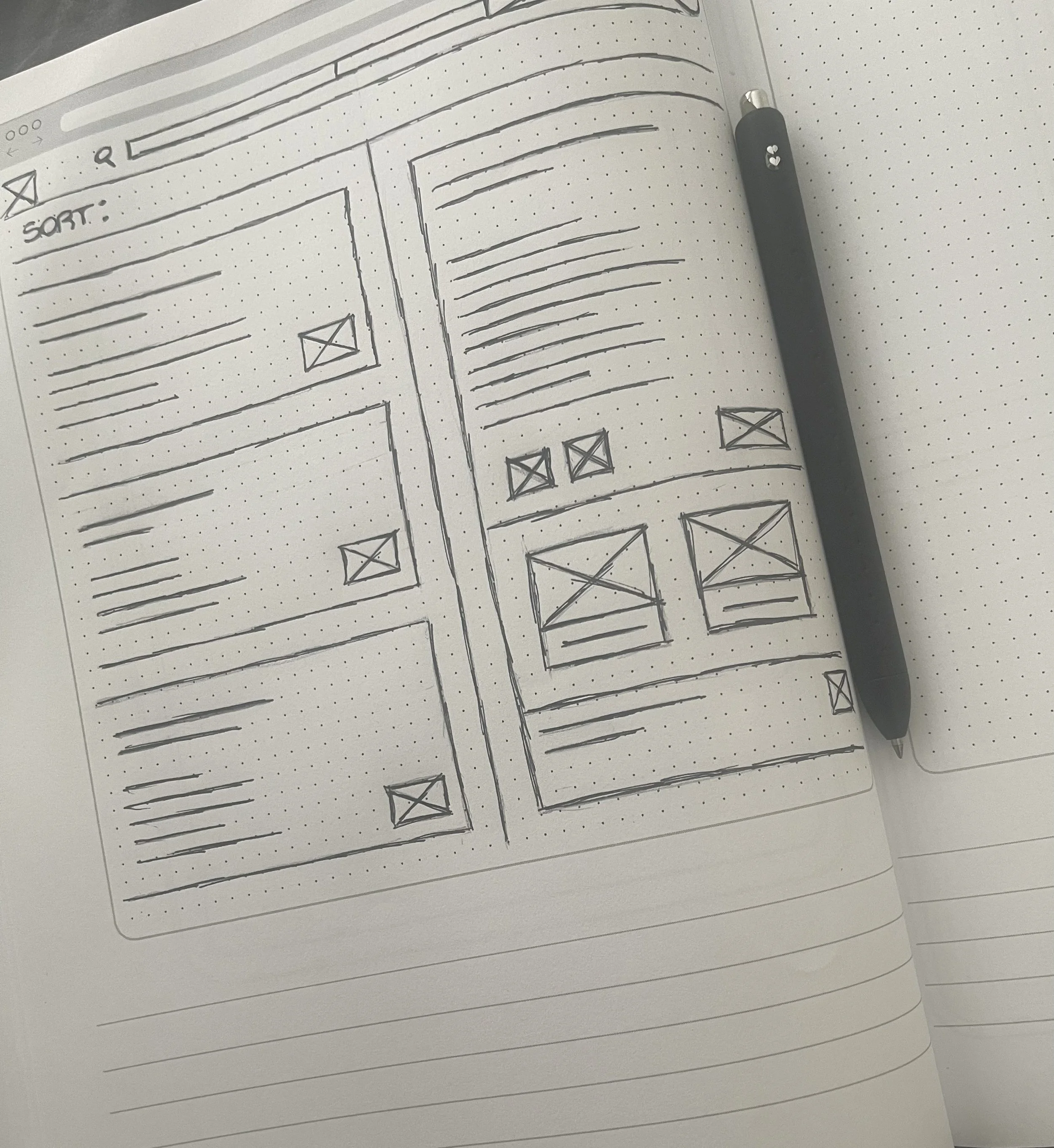
With all the notes and research I gathered I began to design the app. I sketched out several of the main screens, using my user flow as a guide. These rough sketches allowed me to work through my initial ideas effectively.
Low Fidelity Sketches
LO-FI: MOBILE
LO-FI: DESKTOP
Low-Fidelity Wireframes and Prototypes
After sketching out some paper wireframes and thinking through the preliminary flow, I create low-fidelity frames and turned into prototypes to begin the first of two usability studies.
WIREFRAME
PROTOTYPE
Initial design violates Jakob’s law.
Main user flow needs addressing. It seems like an afterthought.
Keep it simple, there is a lot of information so don't overwhelm in other areas.
FINDINGS
Bringing the design to life
S
T
Y
L
E
G
U
I
D
E
I updated the color values to comply with the WCAG color contrast guidelines. This prompted a wider color audit and later, a dramatic change to the color palette, including the primary brand blue.
Accessibility
High-Fidelity Wireframes
After finalizing all of my screens, I created my prototype in Figma to get a better feel of how the app will look and function.
MOBLIE
DESKTOP
Test
To uncover any problems I ran two rounds of usability testing with a total of 8 participants. it led to further improvements. Participants were asked to go through the app and complete 2 small tasks in order to test the crucial features.
GOALS
Observe users’ behavior as they navigate through the app.
See how easily the participant can complete the tasks given to them.
Identify any pain points or concerns the user has while using the app.
ISSUES
C2A too small and needs better distinction
More notation of the features and highlights of notifications
Text too large for mobile
Can take better advantage of negative space
Usability Testing
BEFORE
AFTER
Final Thoughts
Trust the process. It's important to remember the user's perspective and how the contributes to the final design.
Details are important but don't get too caught up that it halts your design process.
Throughout the duration of this project I learned how important it is to consider the worth of designing across platforms.
It's impossible to design the perfect solution on your first try, so constant iteration and testing are essential.
What I’ve Learned
