Fresh & healthy human-grade vet approved recipes
PROJECT
ROLE
DURATION
yFresh
UX/UI Designer
Nov 2023 - Jan 2024
TOOLS
yFresh is a mobile app design to provide users with human-grade fresh ingredients and recipes for their pets.
PROJECT OVERVIEW
PROBLEM
Problem Statement: How might we find/provide healthier alternatives for regular every day dog food?
Imagine you are a pet owner who is trying to find a good balanced and nutritional meal for your beloved dog. You know he has a sensitive stomach, food allergies, and overall is a picky eater. You’re limited by budget and what the local vet recommended is too expensive. Here is where yFresh comes in.
Define
1
Research
2
3
Ideate
Design
4
Test
5
Research
THE RESEARCH PLAN
The goal: is to provide existing and first pet owners a fresh and healthy source of food recipes that are nutritious and pet friendly.
Target Audience: Pet owners 25 - 38.
Channels: Mobile application design.
Competitors: The Farmer’s Dog, Spot & Tango, and Ollie.
I started off by doing a deep dive into pet owners in the U.S. to get a better understanding of the target audience. I wanted to get a better understanding of how users think when it came to their pets. Key details I uncovered were:
About 62% - 66% of households in the U.S. (86.9 million homes) are those of pet owners.
Most American’s number 1 reason for choosing what pet food to buy was health and nutrition.
Most dog owners feed their dogs kibble followed by raw and wet foods.
Owners will feed their pets kibble even if they know it could be unhealthy.
Secondary Research
Heuristic Analysis
Out of all potential competitors only 1 has a mobile app while the rest focus on desktop designs. I conducted a heuristic analysis to get a feel or how the user would experience their product.
After completing a heuristic analysis I began forming a competitive audit. I wanted to figure out what features and categories were successful/unsuccessful and guage their product’s strengths and weakness.
Competitive Audit
I asked some questions and conducted a screener survey to narrow down my potential users and make sure I reach my target audience.
Screening
After completing a screener, I was able to narrowed down my target audience into user groups for interviews.
I sat down with 11 participants ranging in age from 25-38. I wanted to talk to potential users about important key factors that determines their decision making when it comes to their pet and pet food selections.
THE INTERVIEW
INTERVIEW HIGHLIGHTS
“I buy the healthiest cheapest food possible.”
“Sometimes its hard to get my dog to eat. She’s extremely picky.”
“My dog has severe allergic reactions to certain foods.”
“I’ll feed my dog anything as long as it is cooked.”
“I probably spend more at the vet than I do on food.”
“Dog food can be expensive.”
INTERVIEW INSIGHTS
Based off user interviews I can conclude that:
User budget is a key factor for users when choosing what brands to buy for their pets.
Picky eaters (pets) are more common than I initially realized and the refusal to eat can lead to future health concerns.
Pets can have severe medical concerns due to their diet (allergies, weight regulation, loss of fur, skin irritation, etc.).
Everyone isn’t as knowledgable about what is and what isn’t safe for their dogs to consume.
After interviewing these users I starting analyzing and mapping out the data I acquired. I began to unravel a pattern that gave me insight into my target audience and the problems they face. I started first by categorizing my thoughts into an affinity map.
Research Analysis
AFFINITY MAPPING
Define
I then created empathy maps to synthesize the data and to better map out user pain points, goals, feelings, and thoughts.
Empathy Map
I created two personas to represent my target audience. Keeping these personas in mind throughout the design process, helped me keep the users as the center of the design.
Personas
Ideate
How Might We? (HMW)
HMW increase awareness and improve the user's experience of the product offerings?
HMW efficiently provide support for users during meal preparation?
HMW make users feel more confident in the ingredients they feed their pets?
HMW make users feel confident that they have all the information they need?
HMW make the product a more affordable option vs. the competition?
Solutions
Prioritize consistency/ make product memorable.
Vet approved meal plans/recipes. Provide nutritional benefits.
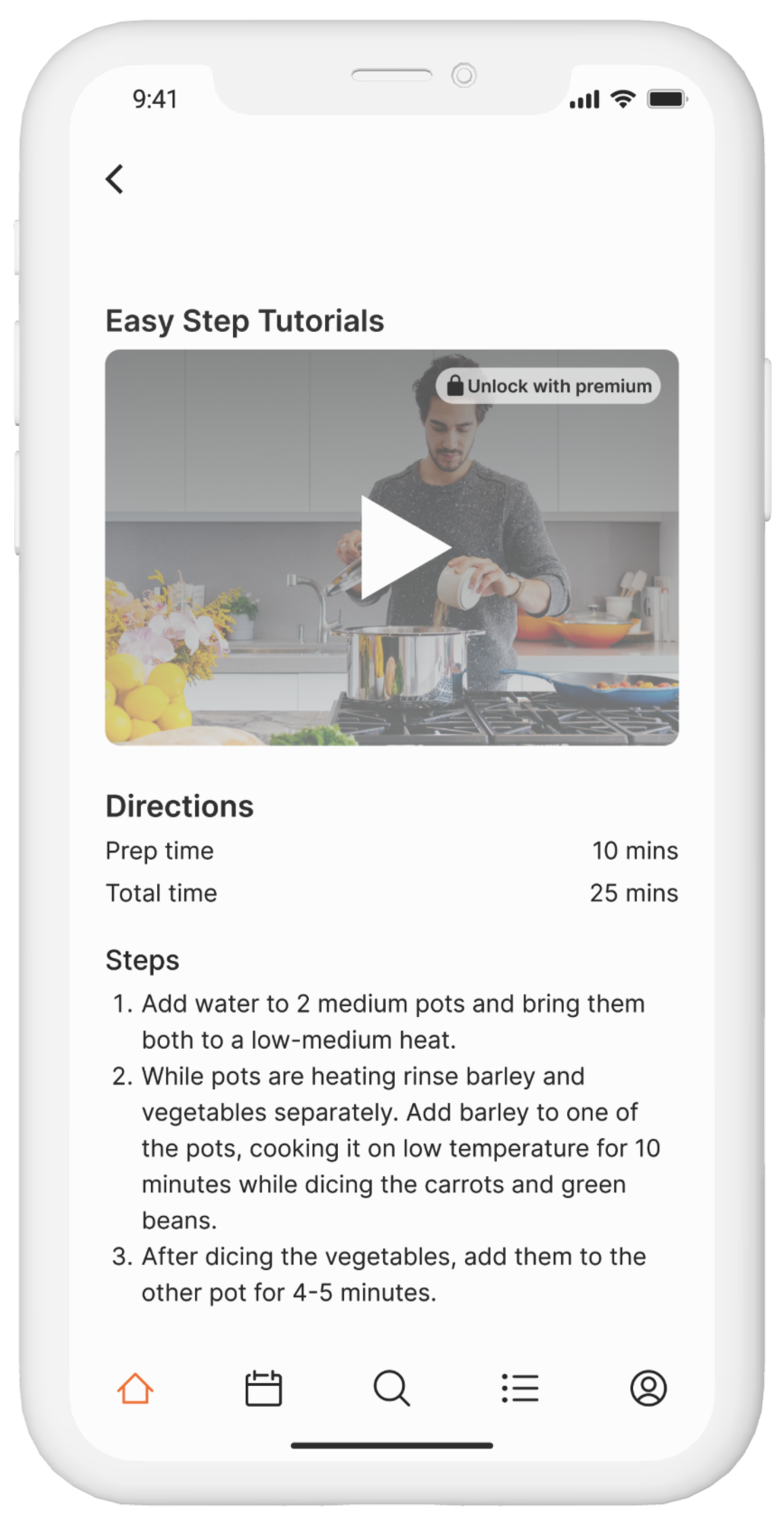
Provide tutorial videos/ break down directions into simple steps to follow.
Make it easy, clear & informative. Prioritize user testing & pay attention to detail.
Provide recipes that you can create with fresh ingredients from the grocery store.
With most of the information architecture figured out, I finished off with creating the a site map and user flow.
Information Architecture
SITEMAP
USER FLOW
Design
With all the notes and research I gathered I began to design the app. I sketched out several of the main screens, using my user flow as a guide. These rough sketches allowed me to work through my initial ideas effectively.
Low Fidelity Sketches
SKETCHES
Low-Fidelity Wireframes and Prototypes
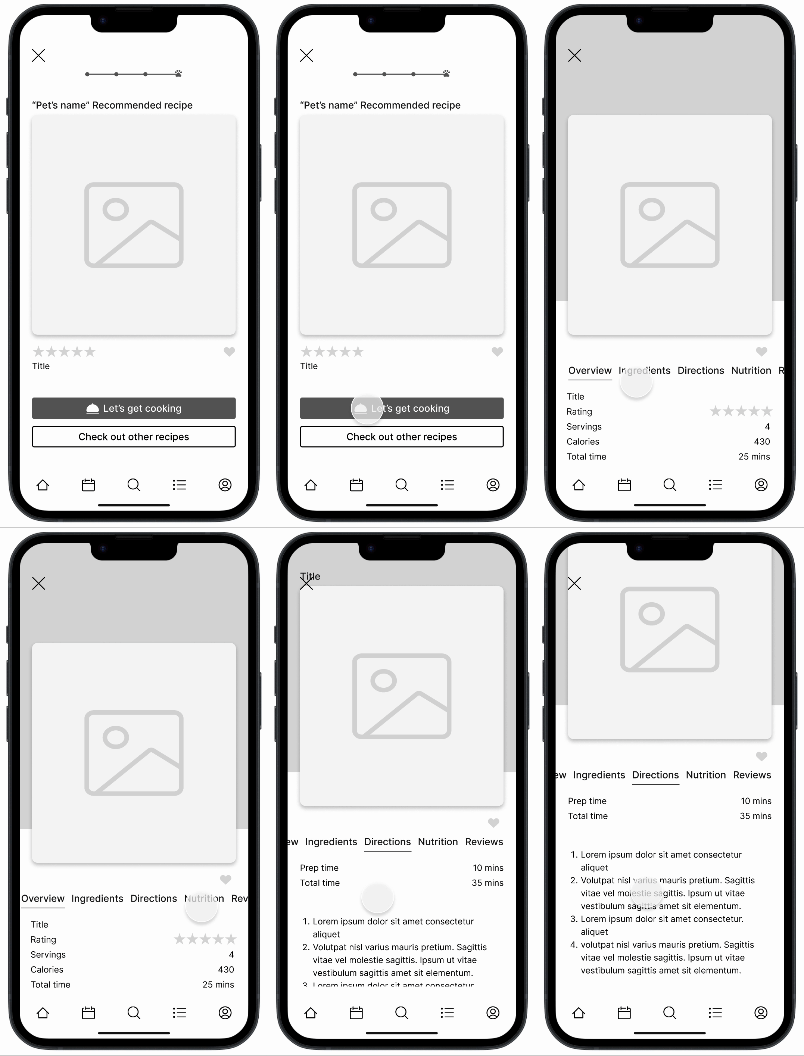
After sketching out some paper wireframes and thinking through the preliminary flow, I create low-fidelity frames and turned into prototypes to begin the first of two usability studies.
WIREFRAME
PROTOTYPE
Bringing the design to life
S
T
Y
L
E
G
U
I
D
E
I updated the color values to comply with the WCAG color contrast guidelines.
All buttons were changed from the brand’s orange to a green that was more suitable for the design.
#000 and #fff together provides a high level of contrast that can strain the eye. To keep contrast above guidelines and allow less strain, all #000 was change to #1E1E1E and #fff was subbed in/out with #f5f5f5
Accessibility
The High-Fi Designs
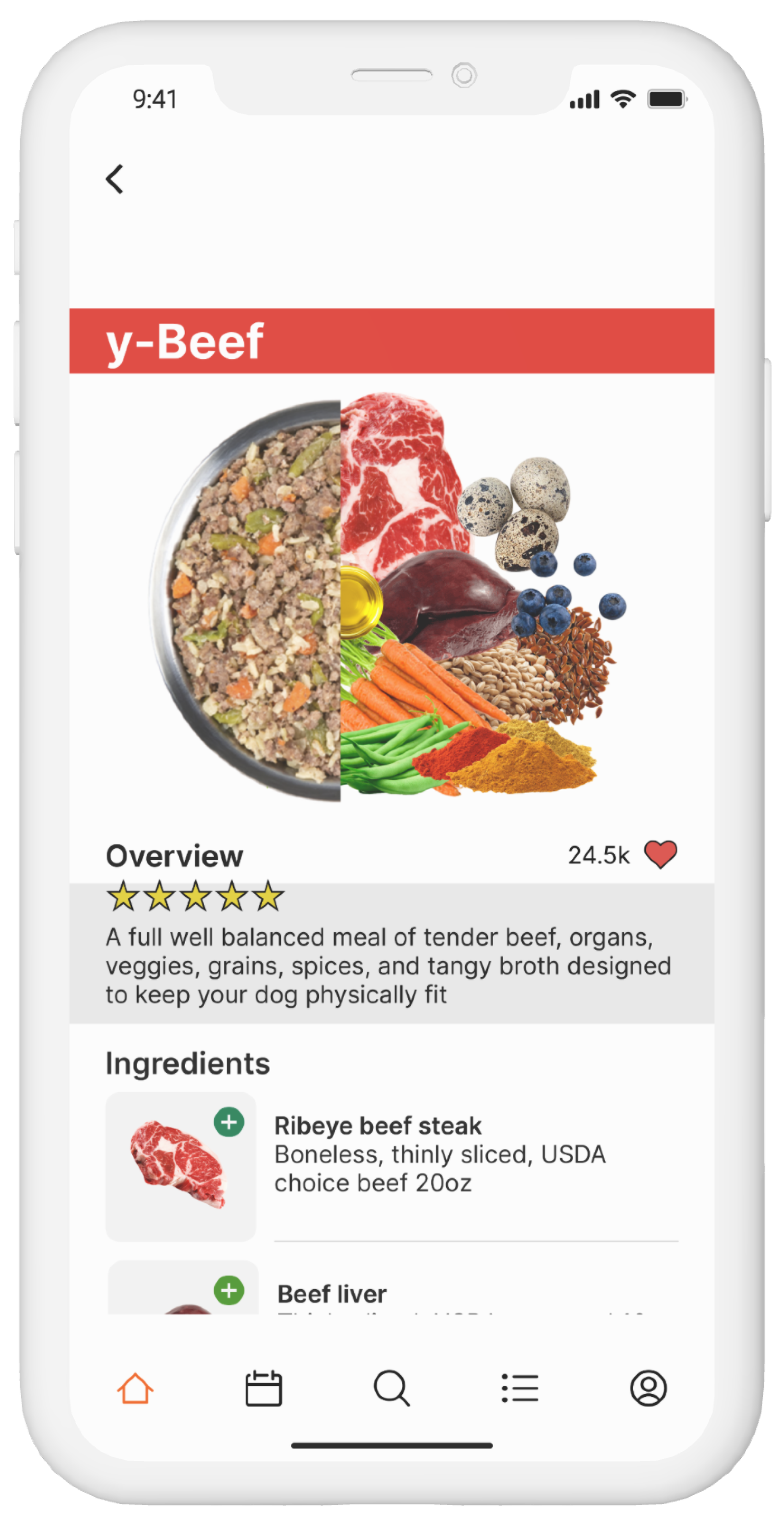
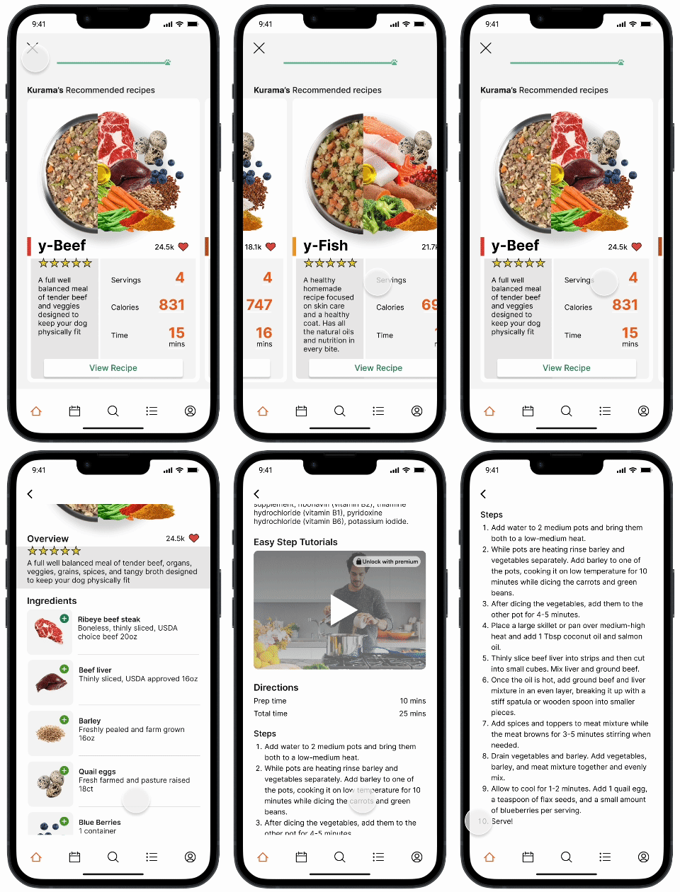
After finalizing all of my screens, I created my prototype in Figma to get a better feel of how the app will look and function.
MOBLIE
Test
After finalizing the designs I ran a few rounds usability testing with the initial group of participants. It led to further improvements.
Usability Testing
KEY FINDINGS: To better customize meals for user’s pets, screens were added to the pet quiz to gather a better understanding of the pet’s overall health conditions and needs.
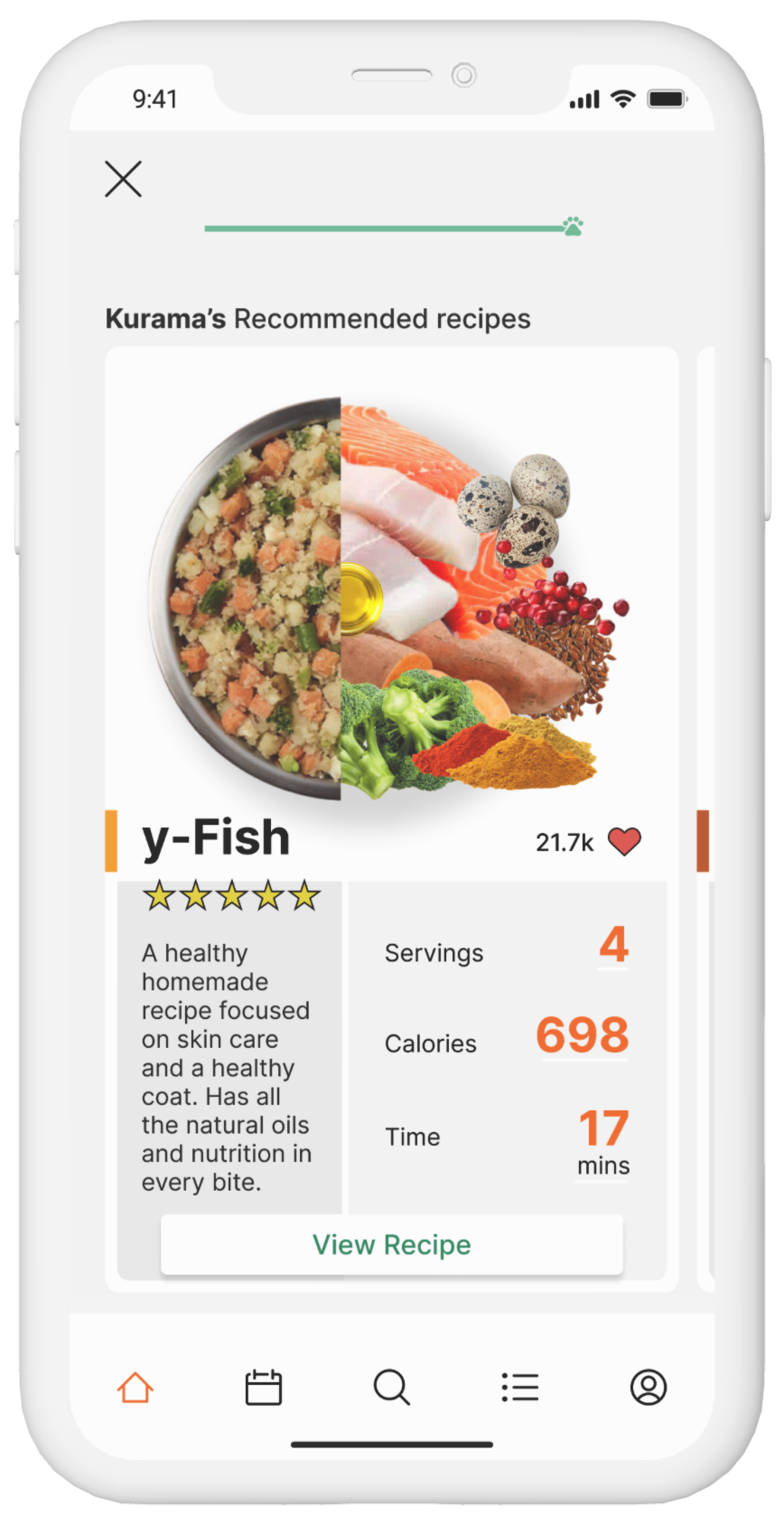
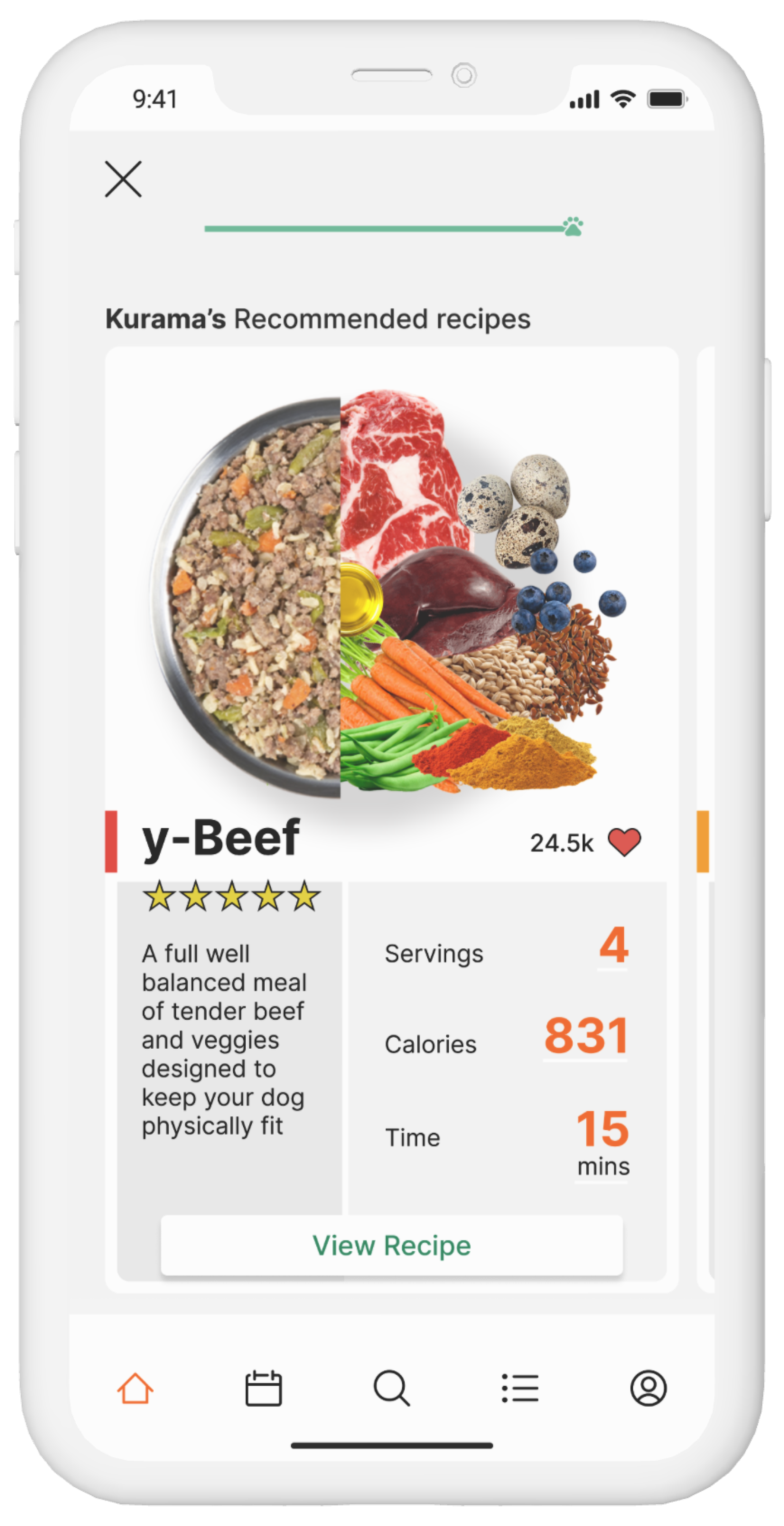
KEY FINDINGS: Initial designs provided users with only 1 meal recommendation once the pet quiz was completed. Results from testing determined users preferred a variety of options to choose from instead of 1.
BEFORE
AFTER
KEY FINDINGS: During testing, it was discovered that the main user flow contained some unnecessary steps and could be shorten. To provide the user with the quickest method possible towards the end goal, several screens were combined into one that is scrollable.
BEFORE
AFTER
Future Steps
A question I constantly ask myself is: How can we encourage users to use the app when their is no motivation to open it? I listed a few alternatives for solving this problem with their pros and cons. Future research/testing is needed to narrow down to the best options.
More Reviews
PUSH NOTIFICATIONS
PROS: A timely reminders to use the app - make pet’s meals, buy ingredients, and more.
CONS: Can annoy users and potentially have the adverse effects.
PLANNING MODE
PROS: Offer a mode to help users plan meals around their personal lives and availability.
CONS: Users might meal prep in bulk, making this option useless.
I’d like to continue exploring more opportunities and recipe configurations for the design. Each year there are new food ingredients discovered that are deemed pet safe and vet approved. To continue personalizing the experience for each user and meet their dietary needs, its encourage that users write reviews of their experience and meal preferences. If I continued this project, next I’d move my focus towards building out the shopping list and profile mechanics.


